Split hero
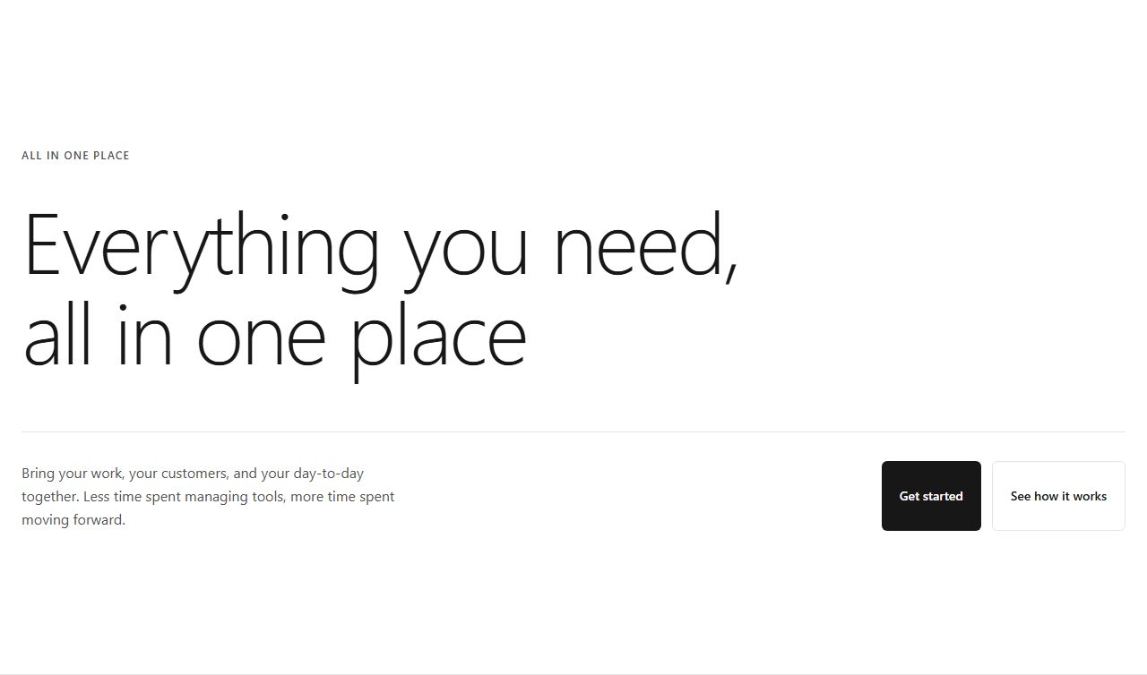
Text left (eyebrow, heading, subhead, two CTAs), image right. Wide and airy.
hero/split/default
The first screen of a landing page: headline, supporting line, call to action, and proof. These hero sections cover split layouts with images, centered statements, product screenshots, oversized typography and floating-card compositions, all sharing one design token contract.
27 variants · neutral wireframe · ready to reskin with your design tokens
Split heroSplit hero with trustCompact split heroSplit hero with statsSplit hero with contact formSplit hero with quote formSplit hero with form and reviewsCentered heroCentered hero with badgeCompact centered heroCentered hero with avatarsAsymmetric heroAsymmetric hero (image left)Asymmetric hero (footer CTA)Asymmetric hero with logosHero with screenshotHero with badge and screenshotHero with logos and screenshotHero with email formBig typography heroBig typography hero (centered)Big typography hero (serif)Big typography hero (with meta)Floating cards heroFloating cards hero (two CTAs)Floating cards hero (with rating)Floating cards hero (compact)
Text left (eyebrow, heading, subhead, two CTAs), image right. Wide and airy.
hero/split/default
Text left with badge, heading, subhead, CTAs, and trust-line below. Emphasizes social proof.
hero/split/with-trust
Tighter split layout with smaller text and square image. Space-conscious variant.
hero/split/compact
Text left, image right, 3-stat row under a divider on the left. Proof numbers surface immediately.
hero/split/with-stats
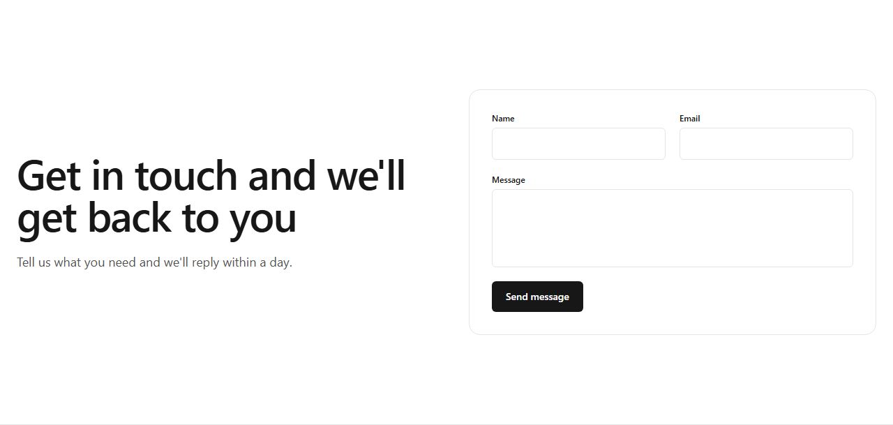
Heading and subhead left, a contact form card right (name, email, message, submit button). Lead capture above the fold for services and small businesses.
hero/split/with-form
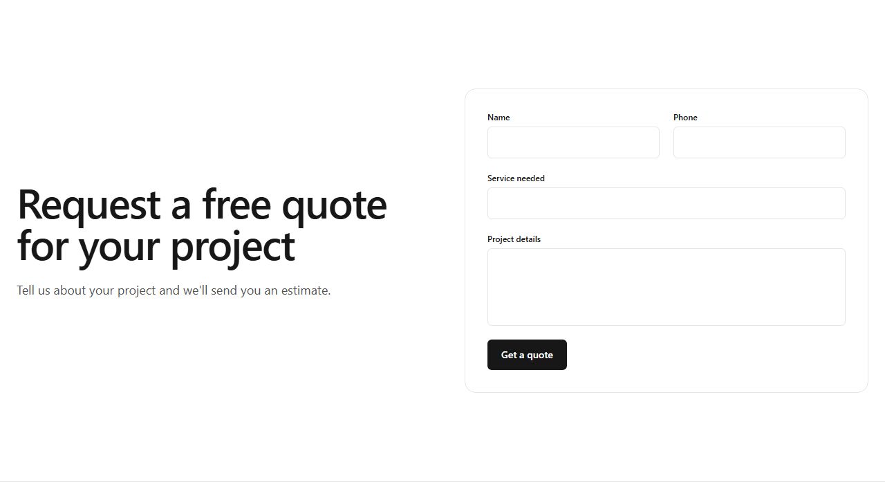
Heading and subhead left, a quote-request form card right (name, phone, service, project details, submit). For trades and service businesses taking estimate requests.
hero/split/quote
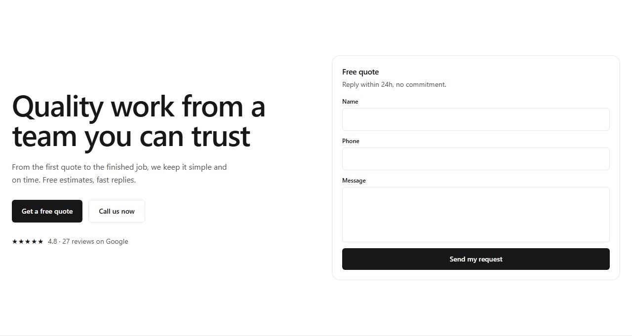
Heading, paragraph, two CTAs and a star-rating review line on the left; a compact lead form card (name, phone, message, submit) on the right. Neutral by default. Built for local service businesses and trades.
hero/split/with-reviews
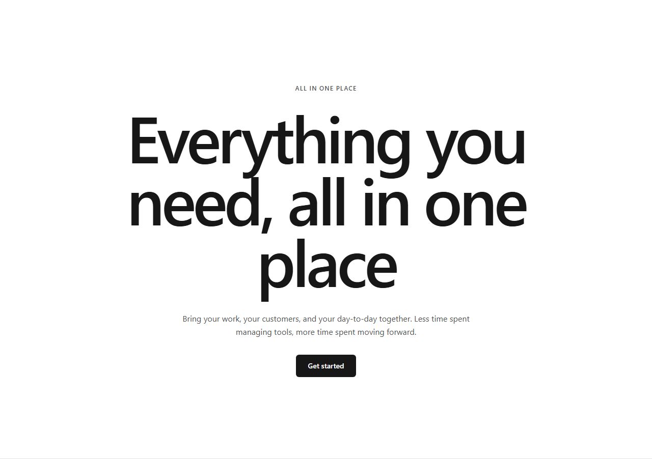
All centered: eyebrow, large heading, subhead, two CTAs, image below. Bold and spacious.
hero/centered/default
Centered layout with inline badge pill (label + text + arrow), heading, subhead, CTAs.
hero/centered/with-badge
Smaller centered hero: eyebrow, heading, subhead, single CTA. Fits mobile-first pages.
hero/centered/compact
Centered layout with eyebrow, heading, subhead, CTAs, then 4-avatar stack + trust-line below.
hero/centered/with-avatars
Huge asymmetric heading, subhead + CTAs left, square image right. Bold typography focus.
hero/asymmetric/default
Image left (square), text right (eyebrow, heading, subhead, CTAs). Reversed layout.
hero/asymmetric/image-left
Huge heading, divider line, subhead and CTAs below in a footer row. Dramatic composition.
hero/asymmetric/footer-cta
Huge heading, CTAs, then 6-logo grid below a divider. Combines boldness with trust.
hero/asymmetric/with-logos
Centered copy (eyebrow, heading, subhead, CTAs), full-width screenshot below.
hero/centered-screenshot/default
Centered copy with badge pill, heading, subhead, CTAs, then full-width screenshot.
hero/centered-screenshot/with-badge
Centered copy, CTAs, trust-line, 6-logo grid, then full-width screenshot.
hero/centered-screenshot/with-logos
Centered copy, email input + submit button inline, footnote, then full-width screenshot.
hero/centered-screenshot/with-form
Huge text left, subhead + CTAs right (desktop). Maximal headline impact.
hero/big-typography/default
Huge text centered, subhead + CTA centered below. Dramatic full-width statement.
hero/big-typography/centered
Serif-like large heading (light weight), divider, subhead + CTAs two-column. Editorial feel.
hero/big-typography/serif-feel
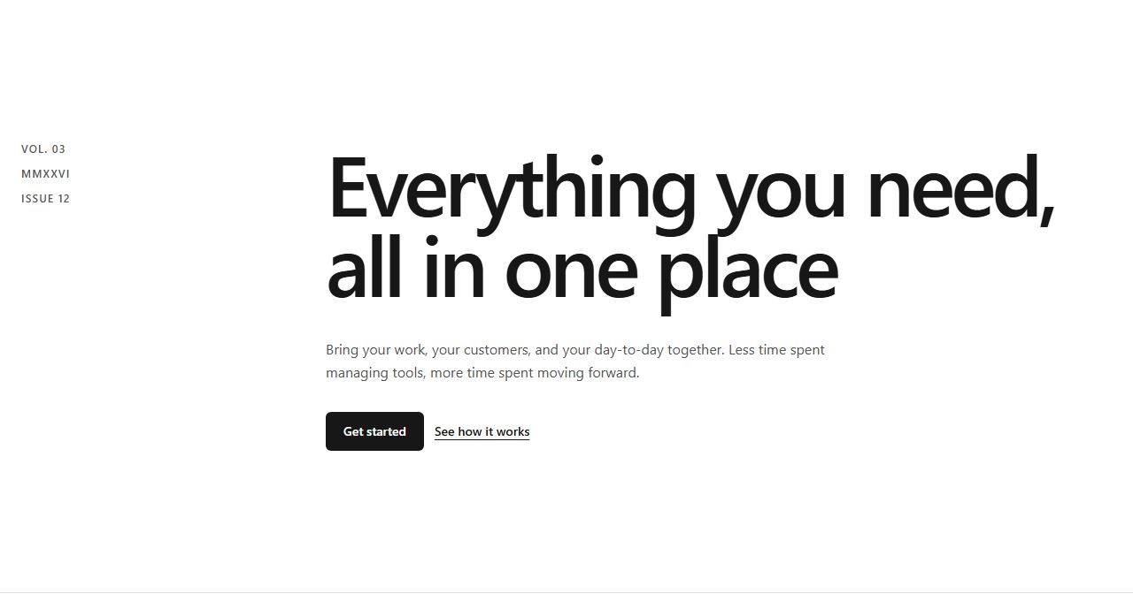
Left column: 3 meta fields (Vol, Year, Issue). Right column: huge heading, subhead, CTAs.
hero/big-typography/with-meta
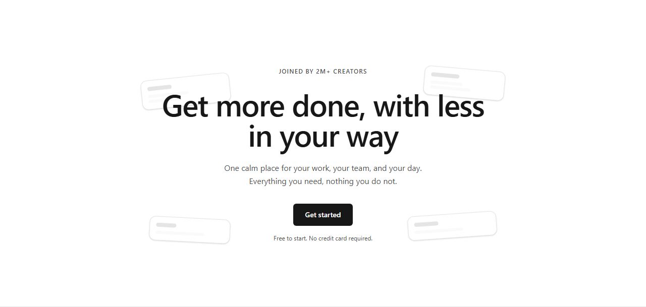
Centered copy with floating card shapes in the background: eyebrow, heading, subhead, CTA, footnote.
hero/floating-cards/default
Same floating card layout with two CTAs side-by-side (primary + secondary).
hero/floating-cards/two-ctas
Floating cards layout with 5-star rating and text above the heading. Trust signal first.
hero/floating-cards/with-rating
Smaller floating card layout with heading, subhead, CTA. Space-efficient variant.
hero/floating-cards/compact
claude mcp add --transport http rifframe https://rifframe.app/api/mcp

> "Add a hero section to my landing page"
Your coding agent can search and pull these sections directly. How it works.