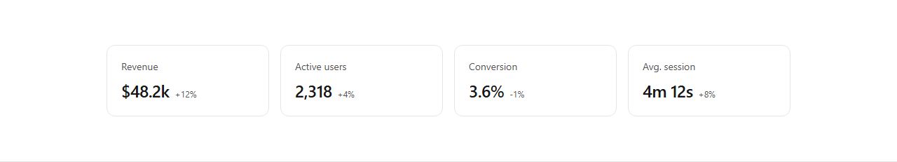
Stat cards row
A row of four KPI cards, each with a label, a large value, and a neutral delta. Spans the full width of a dashboard grid. Scale the number of cards with items.
widget/stat/row-of-4
Self-contained dashboard cards for a 12-column grid: KPI stat rows, line, bar and donut charts (static tokenized SVG), data tables, activity and transaction feeds, user lists, settings panels and empty states. Each declares a recommended span.
12 variants · neutral wireframe · ready to reskin with your design tokens
Stat cards rowStats with sparklinesLine chart widgetBar chart widgetDonut chart widgetData table widgetData table with actionsActivity feed widgetTransactions widgetUsers list widgetSettings panel widgetEmpty state widget
A row of four KPI cards, each with a label, a large value, and a neutral delta. Spans the full width of a dashboard grid. Scale the number of cards with items.
widget/stat/row-of-4

A card listing metrics, each with a value, a delta, and a small trend sparkline. Compact KPI panel for half-width grid placement.
widget/stat/with-trend
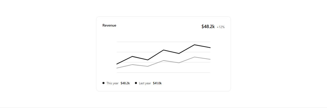
A card with a title, a headline value, a two-series line chart (static tokenized SVG), and a legend. Half-width analytics widget. Legend items scale with the content.
widget/chart/line
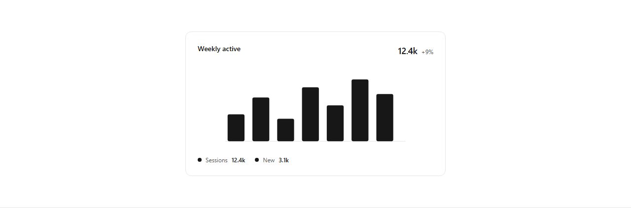
A card with a title, a headline value, a bar chart (static tokenized SVG), and a legend. Half-width analytics widget for categorical data.
widget/chart/bar

A card with a donut chart (static tokenized SVG), a centered value, and a legend with shares. Quarter-width breakdown widget.
widget/chart/donut
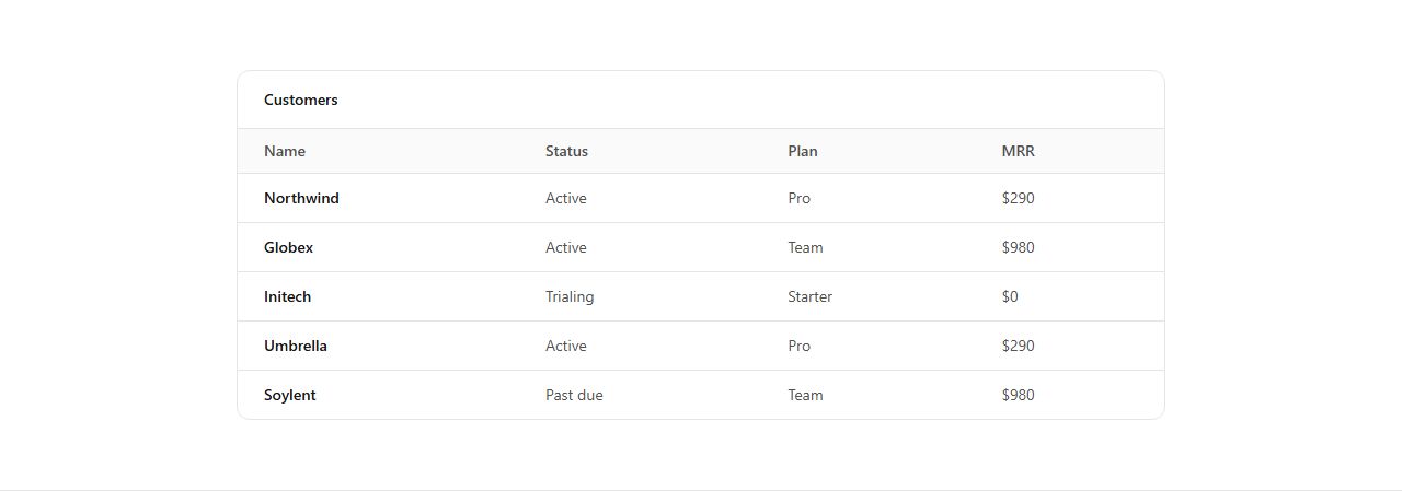
A full-width card with a header bar and a data table (column headers plus text-cell rows). Rows scale with items. The workhorse list of any dashboard.
widget/table/data-table
A full-width data table with an extra right-aligned actions column of inline buttons per row. Rows scale with items. For management views.
widget/table/with-actions

A card listing recent activity entries, each with a marker dot, a line of text, and a timestamp. Quarter-width feed. Entries scale with items.
widget/feed/activity

A card listing transactions, each with an icon, a label, and an amount. Quarter-width feed for finance dashboards. Entries scale with items.
widget/feed/transactions

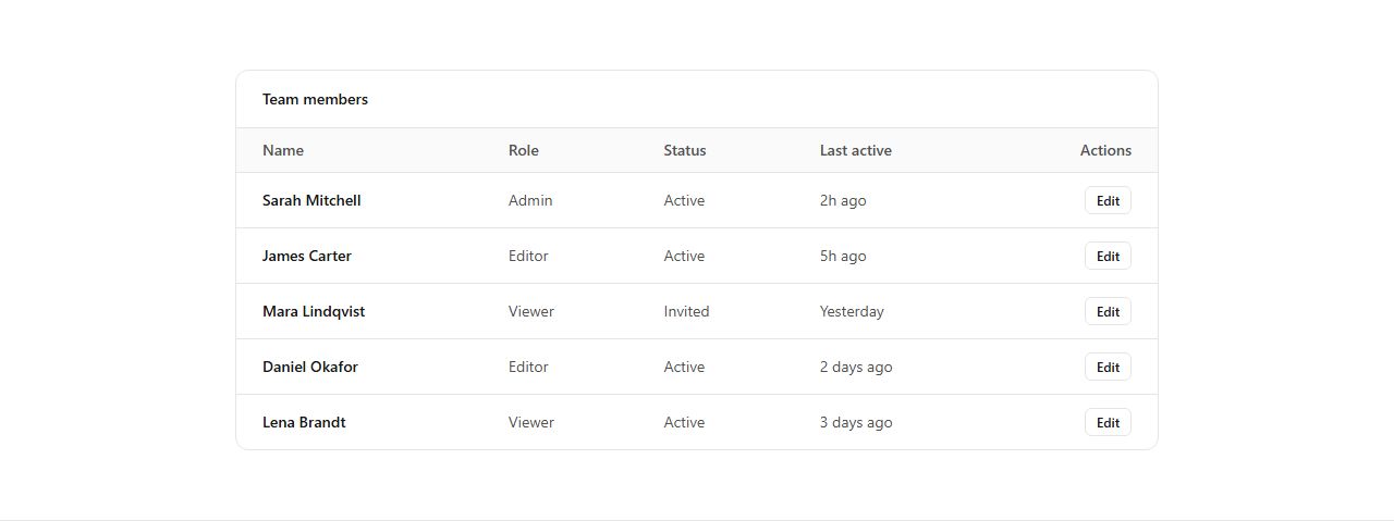
A card listing people, each with an avatar, a name, a role, and a status badge. Quarter-width team or members widget. Entries scale with items.
widget/list/users
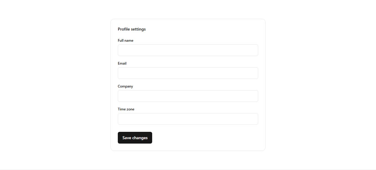
A card with a title and a stack of labelled form fields plus a save button. Half-width settings panel. Fields scale with items.
widget/form/settings-panel

A centered card with an icon, a title, a short message, and a primary call to action. The placeholder shown when a list or view has no data yet.
widget/empty-state/default
claude mcp add --transport http rifframe https://rifframe.app/api/mcp

> "Add a widget section to my landing page"
Your coding agent can search and pull these sections directly. How it works.