Integration logo grid
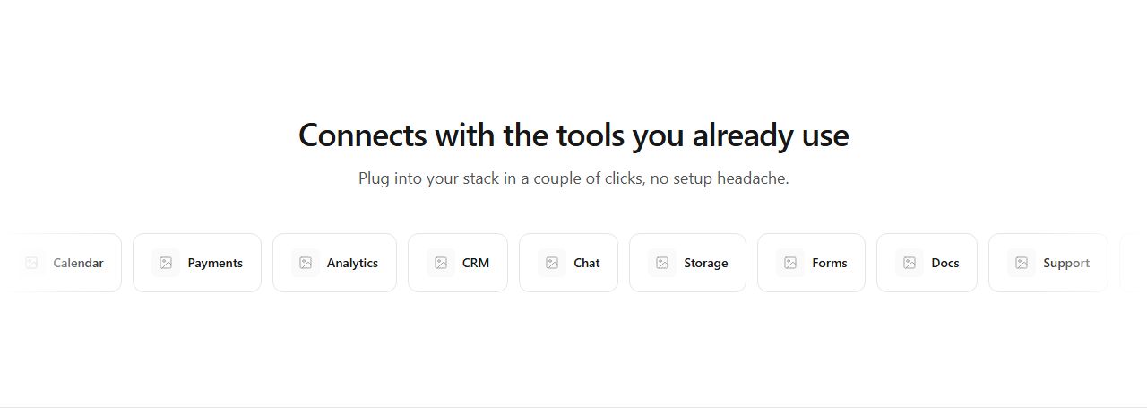
Twelve integration tiles in a responsive grid under a centered heading. Balanced ecosystem showcase.
integrations/default/grid
Show the ecosystem: logo grids, categorized lists, rich cards with descriptions, hub-and-spoke diagrams, logo walls and marquee strips.
17 variants · neutral wireframe · ready to reskin with your design tokens
Integration logo gridCategorized integrationsSplit text and integration cardsSided integration rowsRich integration cardsEditorial integration listCompact integration panelIntegration pillsIntegration trust stripHub and spoke diagramLogo wallFeatured integration plus gridVertical marquee stackHorizontal piercing marqueeHorizontal icon marqueeVertical piercing marqueeDual staggered vertical marquee
Twelve integration tiles in a responsive grid under a centered heading. Balanced ecosystem showcase.
integrations/default/grid
Integrations grouped into labeled categories, five tiles each. Organizes a large ecosystem for scanning.
integrations/default/categorized
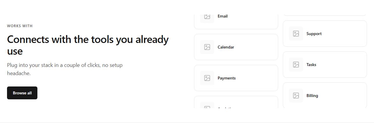
Text block with CTA left, six integration cards right. Ecosystem narrative alongside concrete tools.
integrations/default/split-cards
Logos left, centered text block, logos right (orbit effect). Positions the product at the center of its ecosystem.
integrations/default/sided-rows
Six cards with icon, name, description, and link. When context on each integration matters.
integrations/default/rich-cards
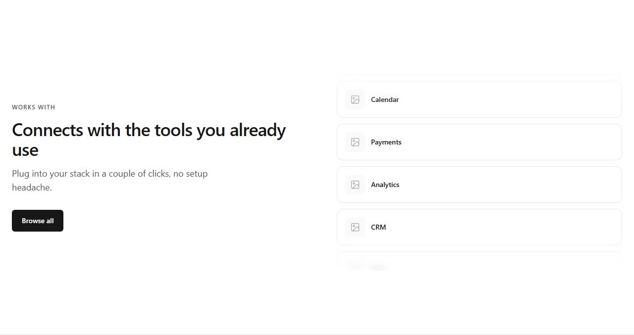
Text block with CTA left, vertical list of integrations with descriptions right. Narrative-heavy storytelling.
integrations/default/editorial-list
A rounded muted panel containing ten small logo tiles. Subtle integration signal without visual weight.
integrations/default/compact-panel
Integrations as wrapping pill badges with icon and name. Casual, scannable list.
integrations/default/pill-rows

Thin band with heading left and six logos right. Non-intrusive trust signal between sections.
integrations/default/trust-strip
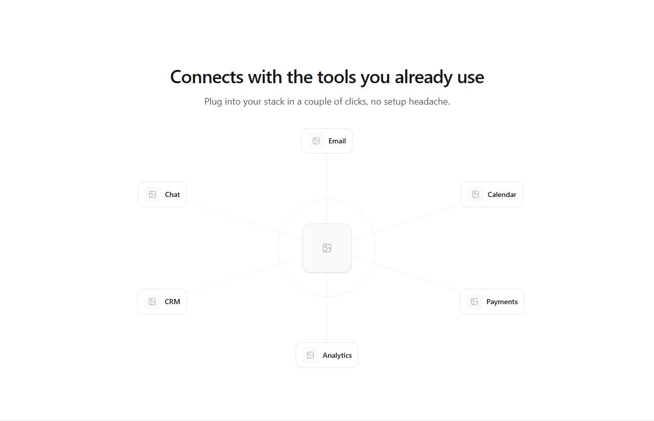
Central product node connected to six integration logos in a radial layout (desktop), compact grid on mobile.
integrations/default/hub-spoke
Dense grid of thirty small logo tiles. Conveys breadth (500+ integrations) at a glance.
integrations/default/logo-wall
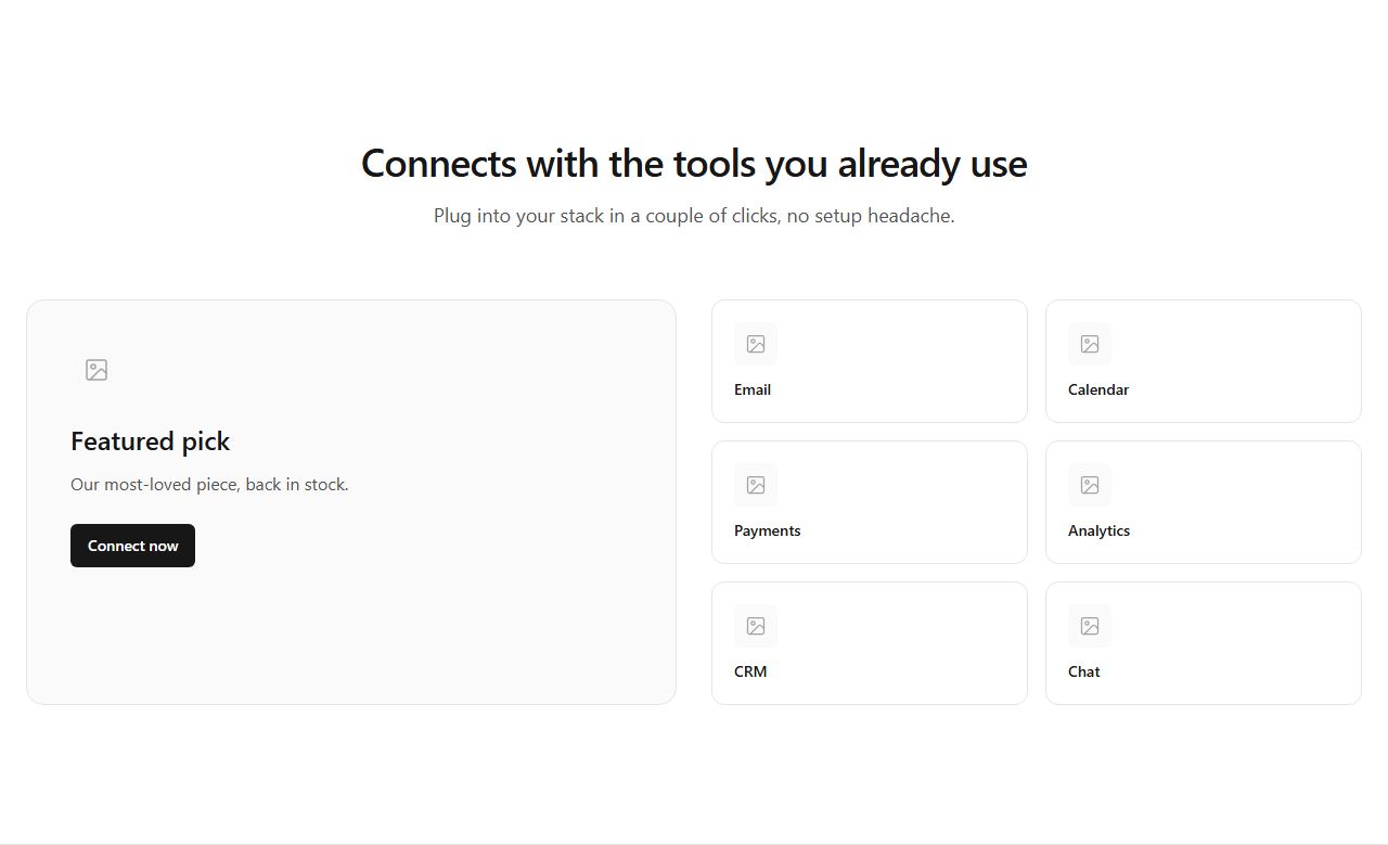
One large featured integration card with description and CTA, six smaller cards beside it. Elevates a key partner.
integrations/default/featured-plus-grid
Text block with CTA left, vertical column of integration cards clipped with fades right. Suggests motion without animation.
integrations/default/marquee-stack
A row of integration cards bleeding past both viewport edges with hard clipping. Bold, edge-to-edge showcase.
integrations/default/marquee-pierce-h
Twenty square icon tiles flowing edge-to-edge with fade overlays. Rhythmic breadth signal.
integrations/default/marquee-pierce-h-icons

Text block left, vertical column of cards clipped top and bottom right. Compact vertical flow.
integrations/default/marquee-pierce-v
Text block left, two staggered vertical columns of integration cards right. Richer vertical showcase.
integrations/default/marquee-pierce-v-dual
claude mcp add --transport http rifframe https://rifframe.app/api/mcp

> "Add a integrations section to my landing page"
Your coding agent can search and pull these sections directly. How it works.