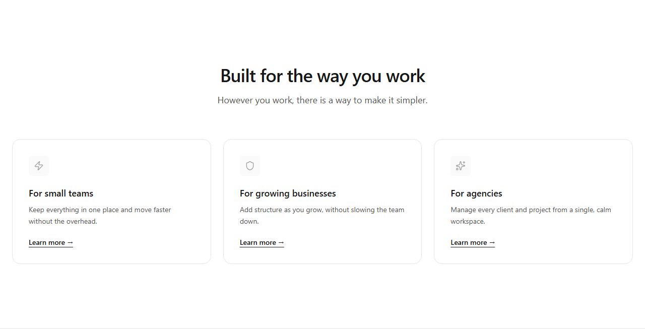
Use case cards
Three bordered cards, each with an icon, title, body and link. The standard who-is-it-for block.
use-cases/cards/default
Who it is for and what it does: persona cards, switchable persona pills, industry tiles and editorial use-case lists.
4 variants · neutral wireframe · ready to reskin with your design tokens
Three bordered cards, each with an icon, title, body and link. The standard who-is-it-for block.
use-cases/cards/default
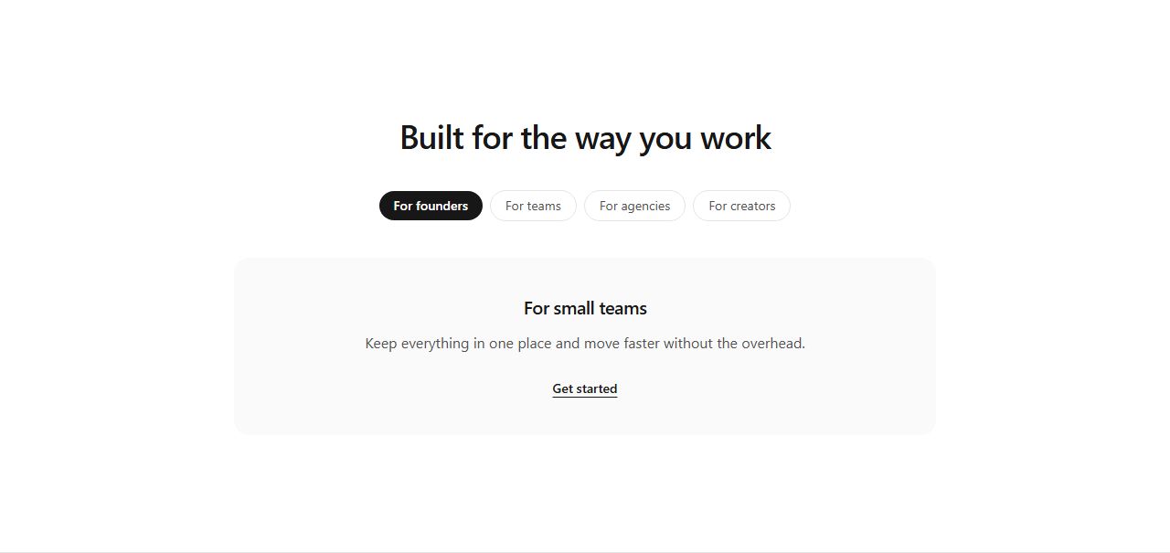
A row of persona pills (first one active) above a muted content panel with title, body and link. Suggests switchable audience views.
use-cases/pills/personas
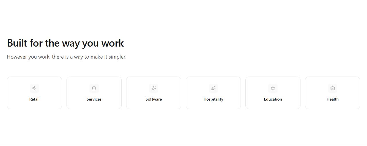
Six compact bordered tiles with icon and industry name. Coverage signal for horizontal products.
use-cases/grid/industries
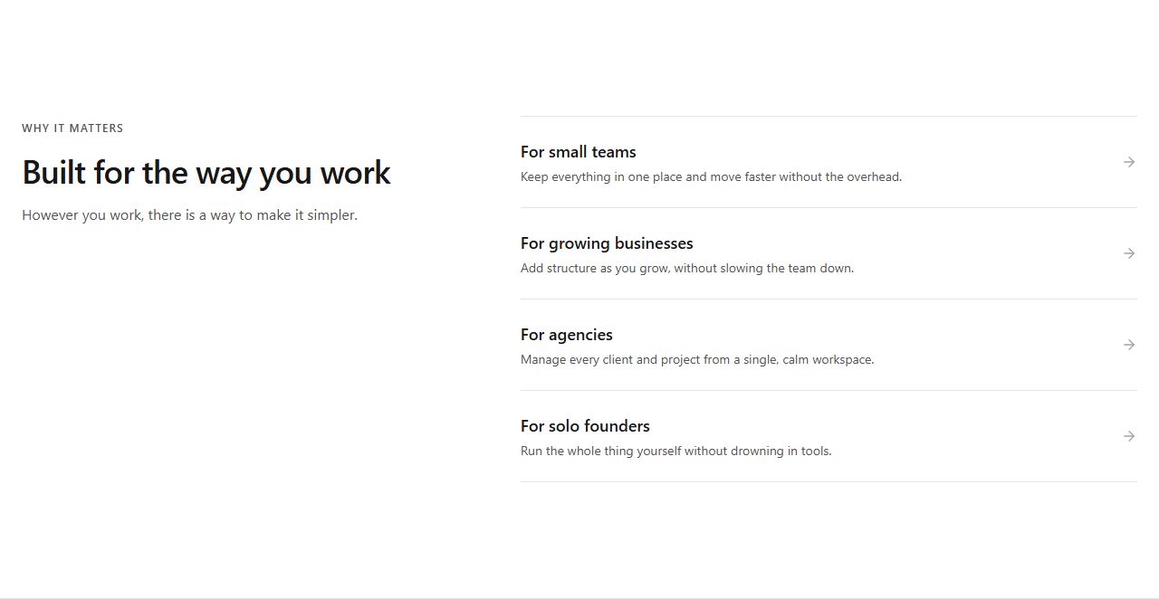
Heading left, four use-case rows with arrows under thin dividers right. Editorial alternative to cards.
use-cases/split/split-list
claude mcp add --transport http rifframe https://rifframe.app/api/mcp

> "Add a use cases section to my landing page"
Your coding agent can search and pull these sections directly. How it works.